
The devil is in the details people. I say it all the time! Jessica really took that to heart and made sure that each small nuance of her event was thoughtfully planned.

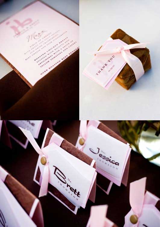
A great feature of this wedding is the use of color. Although their color scheme by definition was pink and brown, Jessica didn’t overuse the colors and instead subtly wove them in with the paper products, floral, and favors. I adore that her cake was out of color theme – this simple detail made the event not look so “matchy-matchy”.
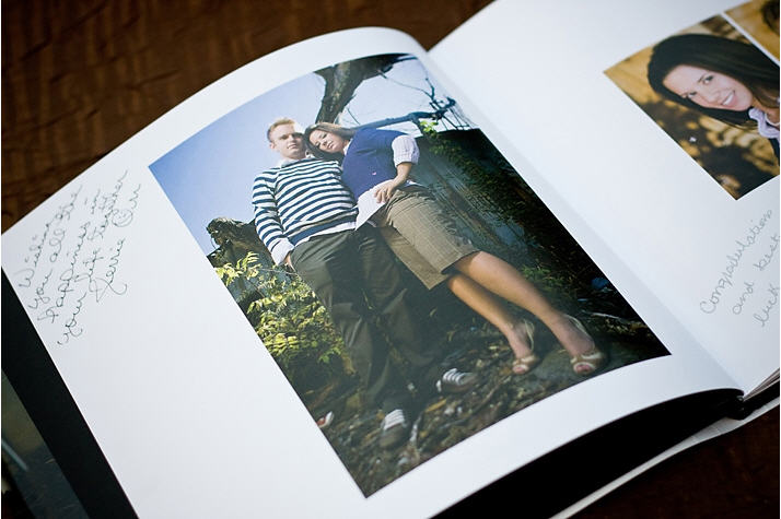
The guest book was a custom created coffee table book where people could write words of wisdom in the margins. What a great keepsake!
Their menus, favor tags, ceremony programs, invitations, save the dates, cocktail stirrers etc. were all designed by Michelle and Mikaely at Designs by MK. The custom “jb” logo they created made appearances throughout the decor. The favor boxes by White Aisle were covered in a flocked velvet paper and reflected the vintage theme.
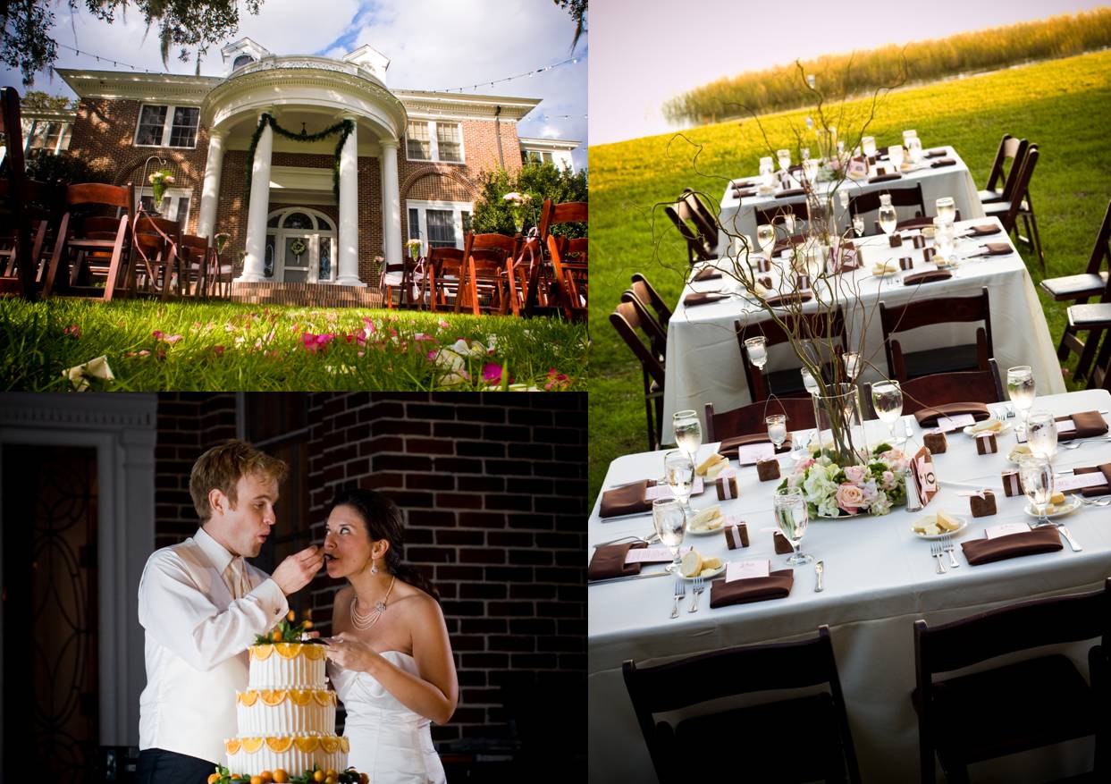
And one of my favorite shots – the backdrop is simply stunning! The Duncan House strung these lights from the trees for Jessica. I love day-leading-into-night receptions because you can create the feel of two different events in one.

My *favorite* part, the portraits, to come later today!
E.
{All photography courtesy of Almasy Photo}