
This is Part II of a two part series on my invitations. You can read Part I on the envelopes here.
When it came time to decide on our invitations, I knew it was going to be an uphill battle. I’ve always been into paper and stationery so of course I was going to be picky, but A too had some strong opinions when it came to invitation design. His main concern was with anything too “girly”. He didn’t want tons of flowers (actually he didn’t want any flowers at all) or overly scripted fonts – which was fine because I didn’t either. We also needed an invitation suite that fit into our somewhat unique color scheme of plum, mustard and charcoal gray.
And as with every step of the wedding planning process – budget was a big issue.
We started at our neighborhood Paper Source, which is usually my go-to place for all my papery needs (literally, my paper source. Ha! Moving on…). I had long envied the couples who spent sunny Saturday afternoons curled up by the window at Paper Source, casually flipping through the volumes of invitation samples, pointing and smiling and discussing everything they liked. Unfortunately, that is not the experience we had. Everything we found at Paper Source seemed too cliché. Nothing felt like us. There was very little in our color scheme and to top it all off, it was all pretty pricey.
That’s when I emailed Lynne Johnson at the Inviting Company. I originally asked her to send me some pricing on a particular line she carried. She emailed back and said,
“This is more than a business to me. It is my passion. I am sure once you sit with me and see how I can help you design the perfect invitation that will reflect you, your fiancé and your event you will see this. I do more than just invitations and I will be happy to show you what I can do. Most importantly, I pride myself in working with all budgets. I carry many commercial companies from the high end to the economy brand. HOWEVER, I very rarely sell invitations from the books.
I am a creative stationery designer with a background in fine art, greeting card design, and advertising. I have a great affiliation with a printer in Maine who does all my custom printing and this allows me creative freedom while keeping costs in check. An invitation should reflect the bride and groom and the event they are creating…my invitations are all colors with custom monograms and personalized drawings of things that reflect you.”
Needless to say, I set up an appointment with her. And we were thrilled to discover that with Lynne we could design a 100% custom invitation from the paper, to the wording, to the font, to the graphics. Every element was completely up to us (with her expert guidance of course) and she even included custom drawn pieces. And the beauty of it all was that the whole thing, including the inserts, reply envelopes, outer envelopes, everything – was all in budget. Now I know we all have different budgets out there, but if invitations are important to you but you don’t want to spend over $1,000, go to Lynne. (Of course, if you’re looking for luxury invitations, she can more than do that too!) You will not be disappointed. And Lynne works with brides and grooms all over the country so even if you’re not local to Boston – call her.
Now, let’s explore the invitations we designed!
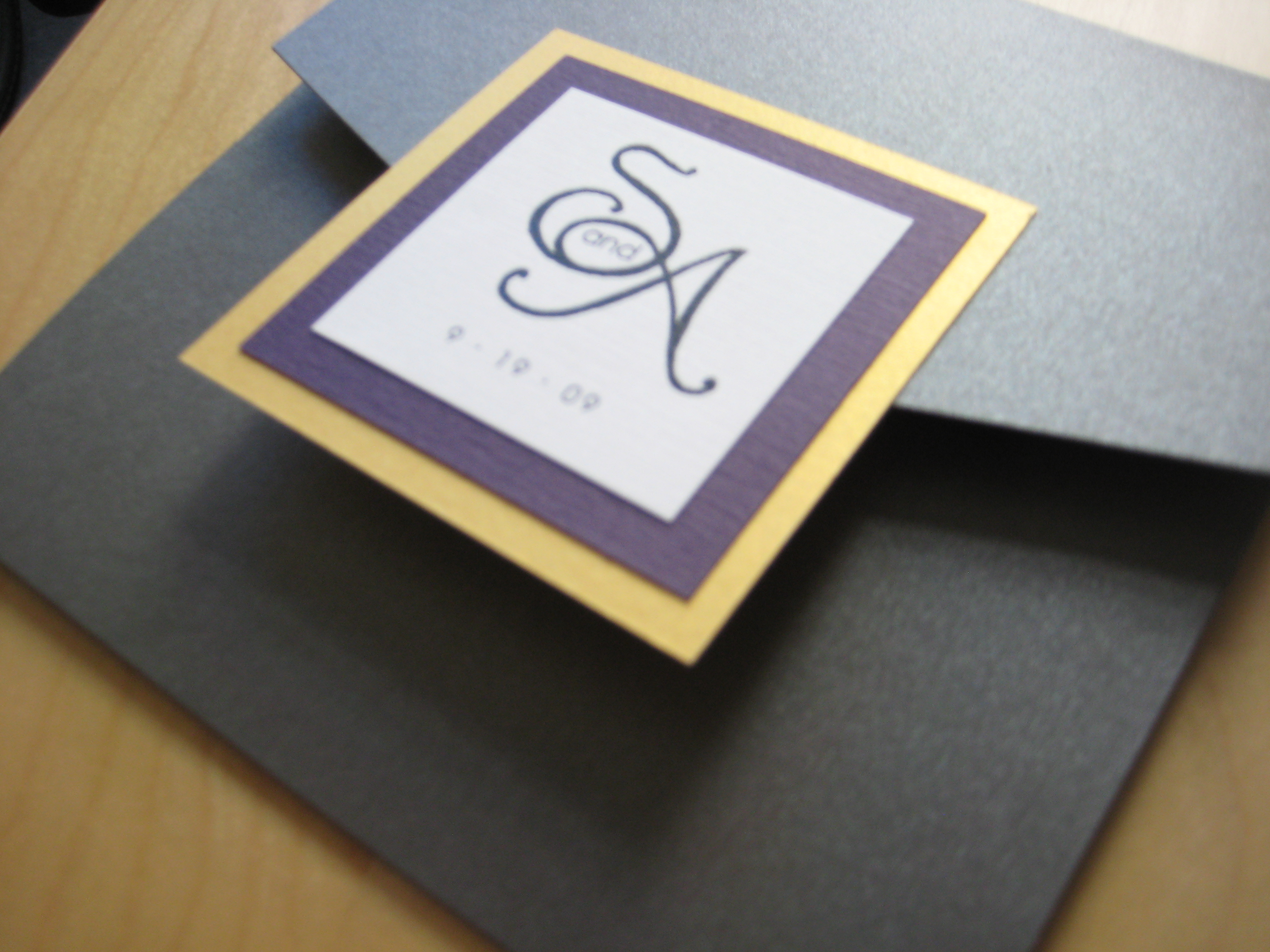
Outside of the invitations. They fold up into this neat little package.
Close up on the seal. We’ll use these on our programs as well.
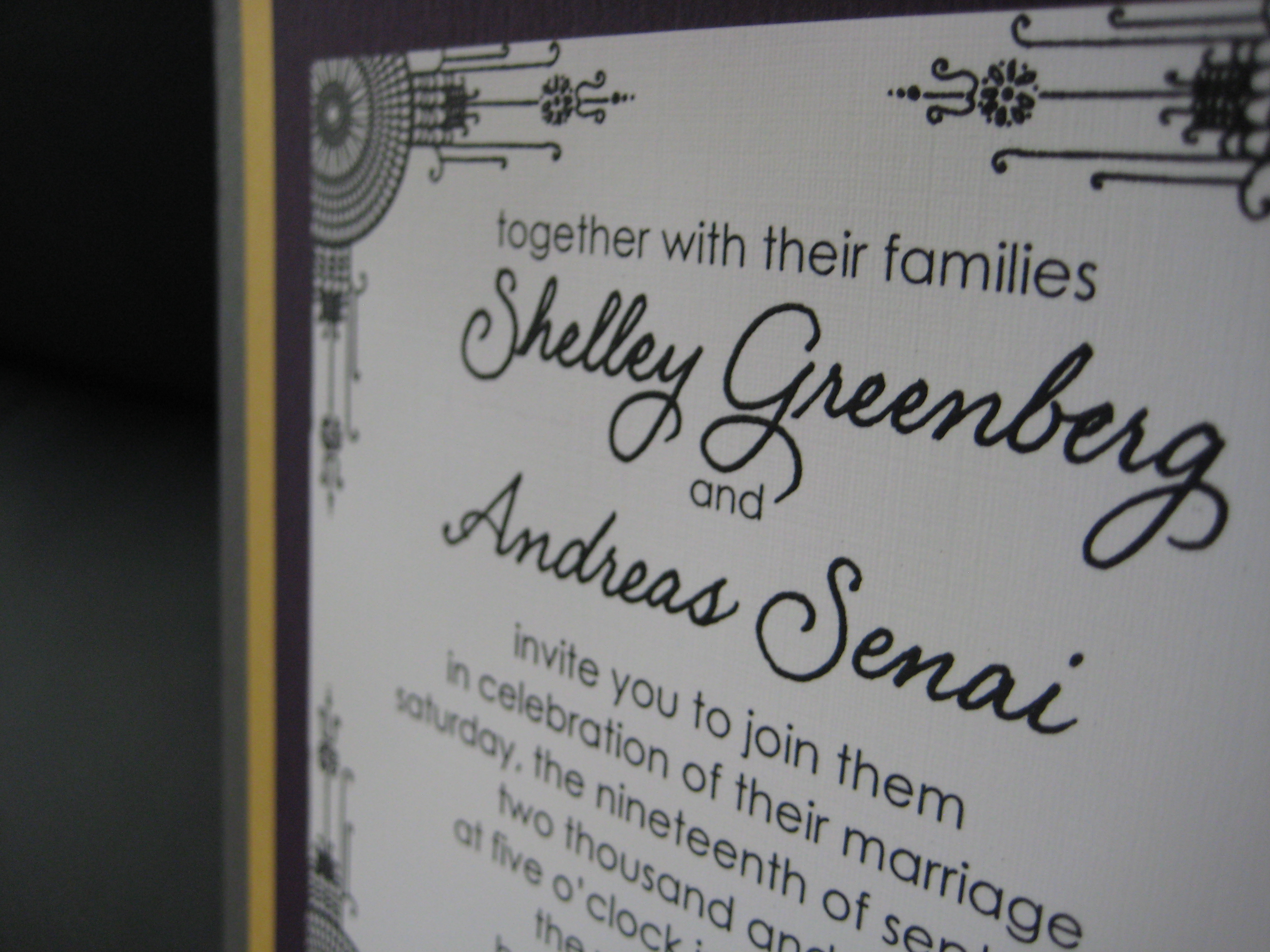
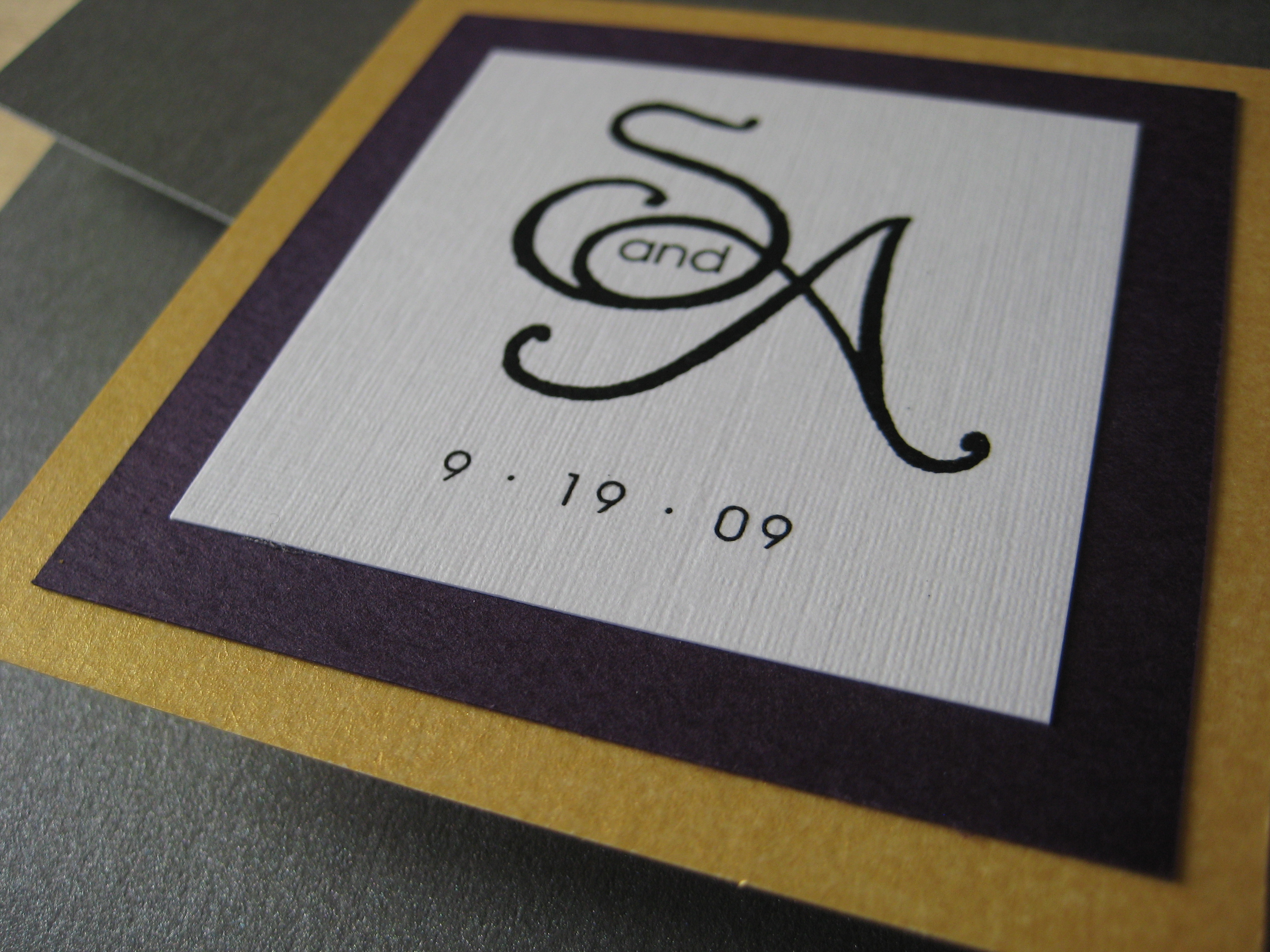
The invitation itself. Lynne custom drew part of the design elements in the corners and wrote our names.
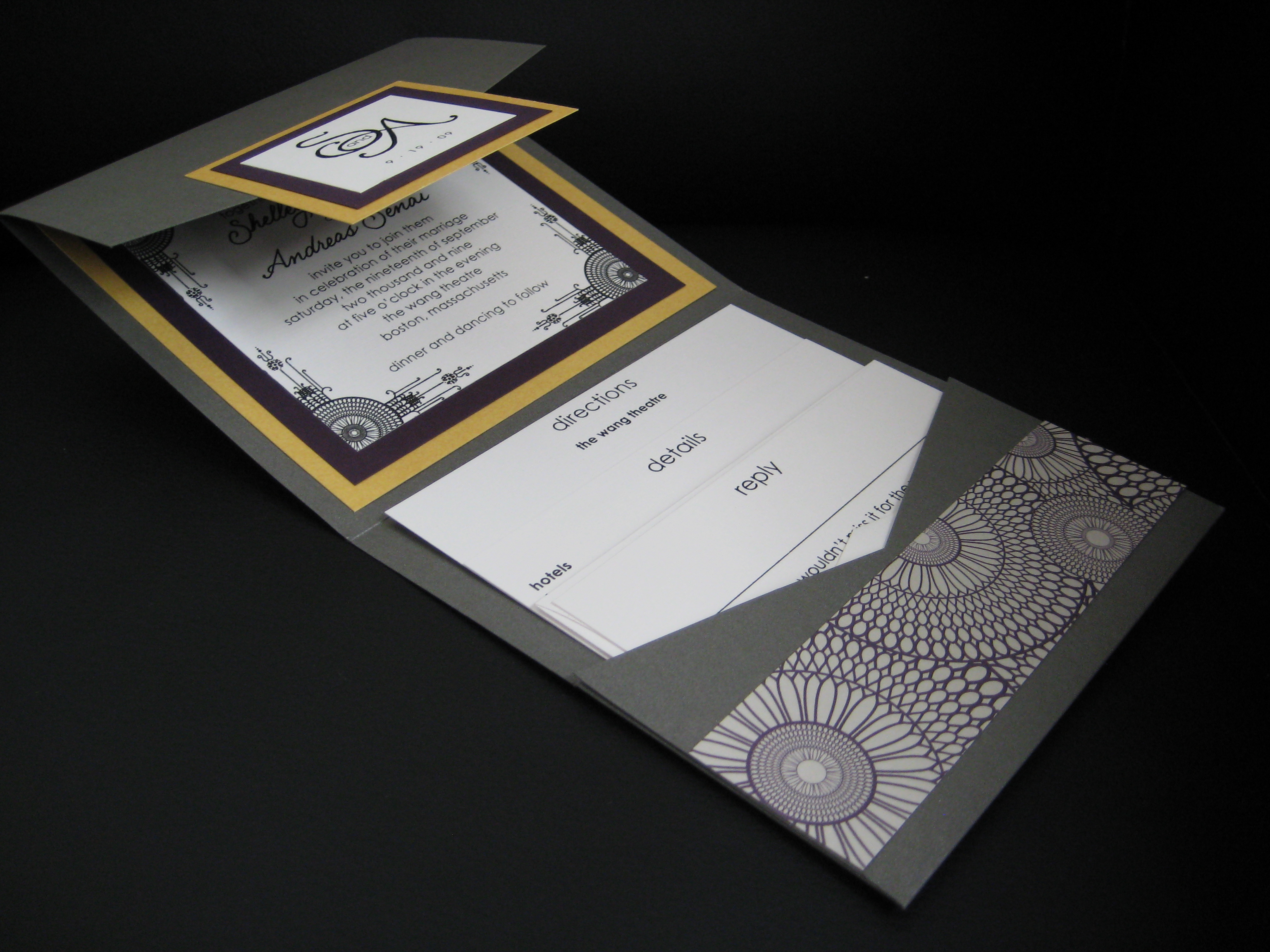
All opened up.
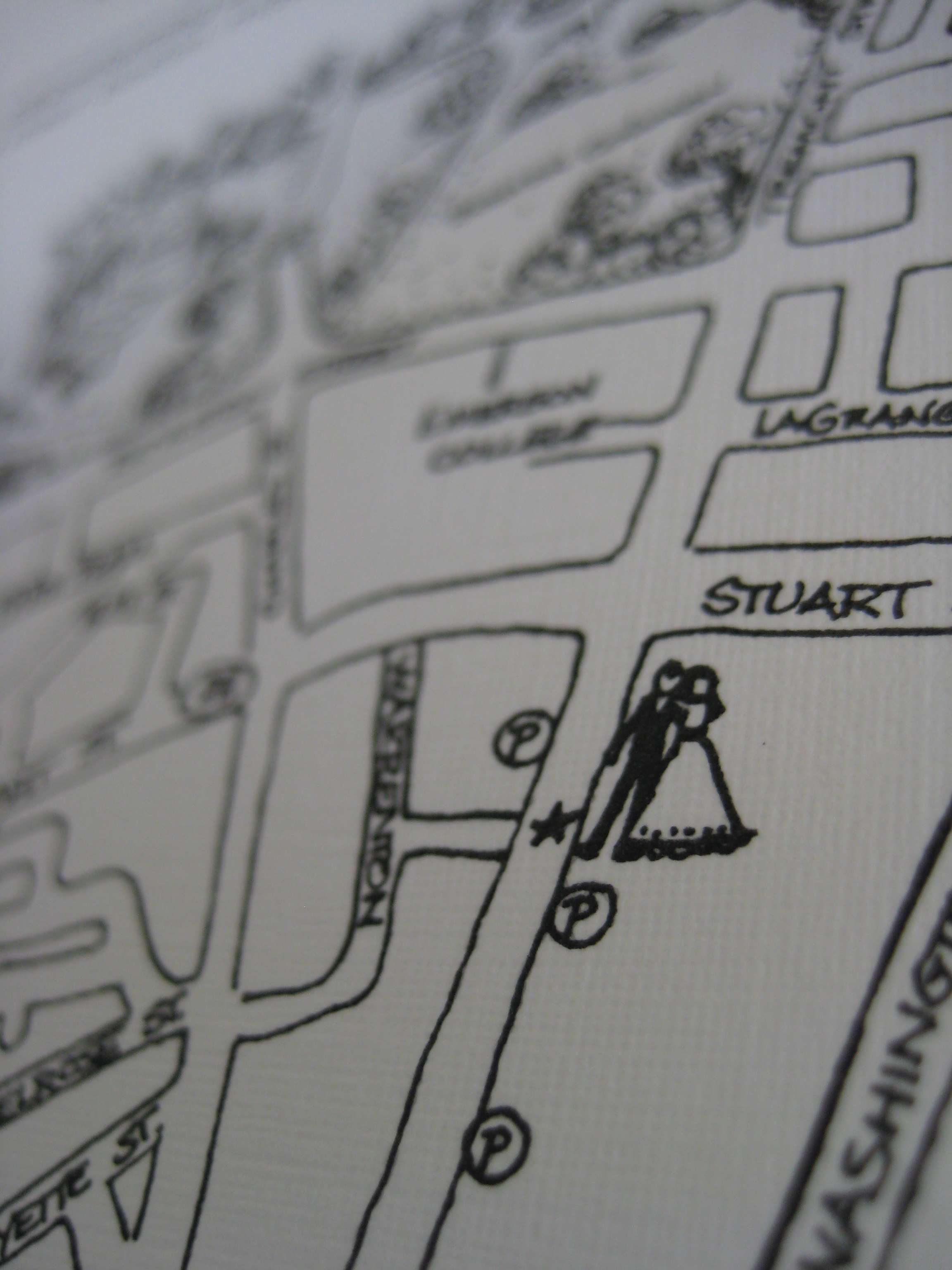
Close up on the custom map she drew for our directions insert. I love the little bride and groom where the Wang Theatre is!
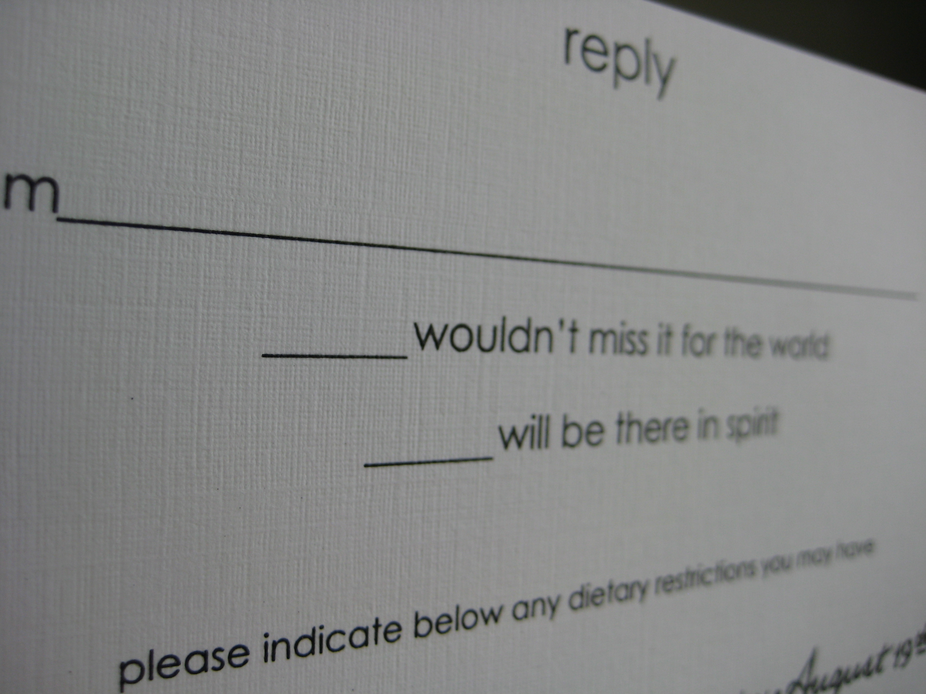
The wording on our reply card.
So those are our invitations! What do you think?